数据会聊天之用Python预测时间序列
发布时间:2021-10-23
## 今天以一个叫Federal Reserve Board Production Index的数据为例,来展示如何用Python进行时间序列建模和预测,数据可从附件下载。使用的模型是Seasonal ARIMA。关于波动率的GARCH模型以后再分享。
##载入程序包, 第一期已经介绍了以下程序包,这里不再赘述
import pandas as pd
import statsmodels.api as sm
import numpy as np
import matplotlib.pyplot as plt
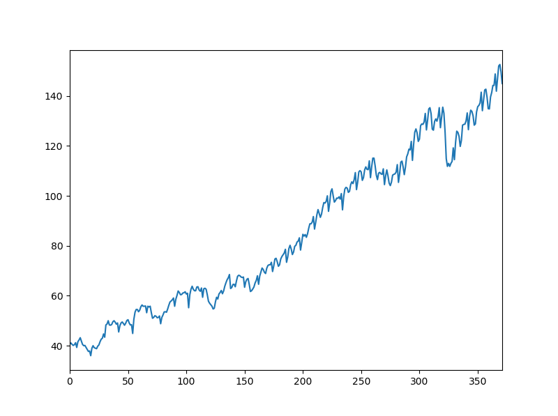
##读取数据
df=pd.read_csv("D:/mypy/Prod.csv") #我存在自己D盘mypy文件夹里,数据见附件
prod=df['x']
prod.plot(figsize=(8,6)) #设置图形大小
plt.show()
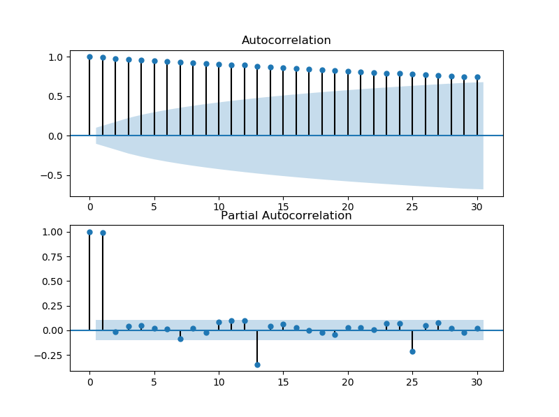
##相关性分析
data=pd.Series(prod) #转换成时序型数据
fig=plt.figure(figsize=(8,6)) #创建新图形窗口,并设置大小
ax1=fig.add_subplot(211) # 一个图形窗口设置成2行1列,在1行画图"ax1", 第二行画"ax2"
fig=sm.graphics.tsa.plot_acf(prod,lags=30,ax=ax1) #画自相关系数图ACF
ax2=fig.add_subplot(212)
fig=sm.graphics.tsa.plot_pacf(prod,lags=30,ax=ax2) #画偏相关系数图PACF
plt.show()
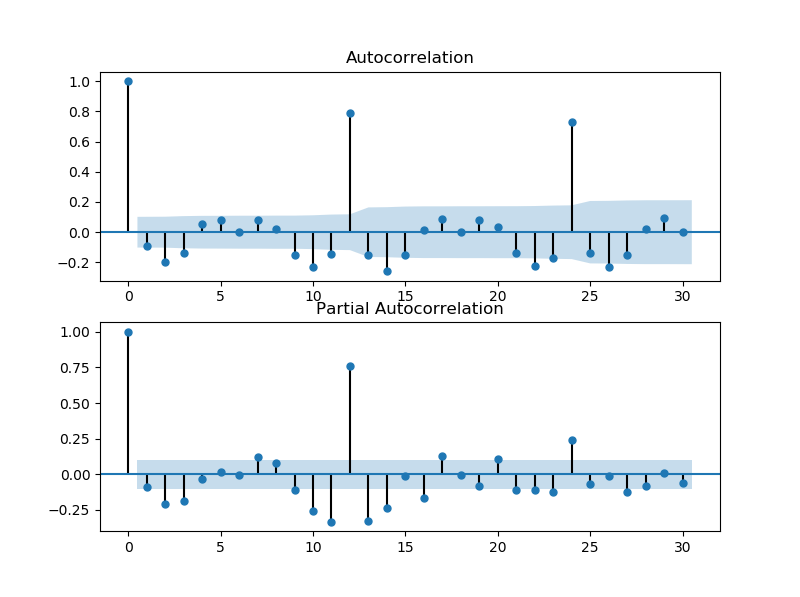
##有明显趋势,一阶差分
d1dat=np.diff(prod)
fig=plt.figure(figsize=(8,6)) #创建图形窗口,可设置大小
ax1=fig.add_subplot(211) # 一个图形窗口设置成2行1列,在1行画图"ax1", 第二行画"ax2"
fig=sm.graphics.tsa.plot_acf(d1dat,lags=30,ax=ax1) # 非常明显的年周期性, period=12
ax2=fig.add_subplot(212)
fig=sm.graphics.tsa.plot_pacf(d1dat,lags=30,ax=ax2)
plt.show()
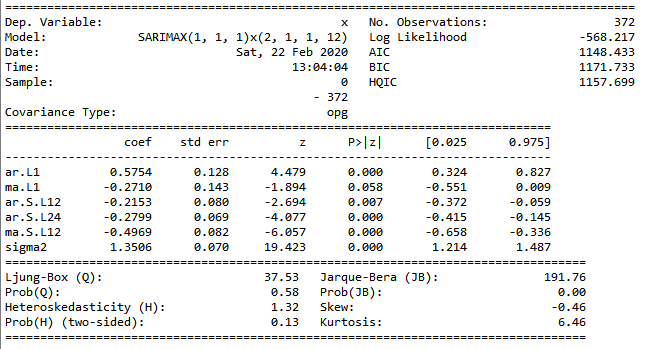
##模型拟合, 我们这里尝试一个ARIMA(p=1,d=1,q=1)*(P=2,D=1,Q=1)s=12的季节ARIMA模型
Sarima_mod=sm.tsa.SARIMAX(prod,order=(1,1,1),seasonal_order=(2,1,1,12)).fit() #模型拟合
Sarima_mod.summary() #拟合结果
pred=Sarima_mod.get_forecast(steps=12) # 向后12步预测
pred.predicted_mean # 预测均值
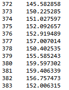
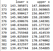
pred_ci=pred.conf_int() #预测置信区间
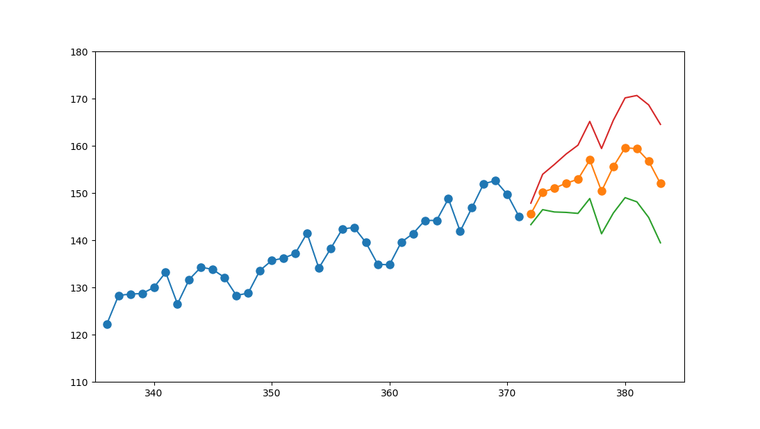
prodtc=prod[336:] #截断时序,为了方便看出预测趋势
fig=plt.figure()
prodtc.plot(figsize=(8,6)) #截断时序图
pred.predicted_mean.plot() # 12步预测均值
pred_ci['lower x'].plot() # 12步预测置信下限
pred_ci['upper x'].plot() #12步预测置信上限
plt.ylim((110,180))
plt.xlim((335,385)) #调整图像纵轴横轴范围,下图蓝色是原始截断时序,橙色是预测值,绿色红色是95%置信区间